A2: Photographing the Unseen.

Overview

This assignment required a subject that might be considered “unphotographable” The first requirement of the process was to identify subjects that fit this remit. I identified the following:

  • Ageing
  • Belonging
  • Being myself
  • Anonymity
  • Worry / anxiety
  • Love
  • Loss / grief

Any of these ideas could have been used as the subject matter for such a photographic assignment. But right now, in the midst of a global pandemic, at a time when our government, scientists  and the country as a whole are struggling to find answers I find myself locked down at home.  My employment is suspended without end in sight but I am not alone. Across the country millions of people are in the same position, pub’s cafe’s restaurants and all but essential shops are closed, social distancing measures are enforced and our population’s movement is restricted. Considering the above, the answer to the question as to what subject matter to use for this exercise is obvious, it has to be “Pandemic”. 

Approach

Background

UK lockdown regulations meant that spending time outdoors was limited additionally that time had to be for essential shopping or exercise. We were permitted to take a camera with us when exercising but that didn’t extend to spending hours outside looking for a photographic opportunity. With travel by car restricted I had to plan how I could capture the images I wanted. 

Planning Tools

Apple Notes app was used on both iPad and phone to keep notes of ideas as they developed over time.  Mind maps were used to consolidate my thinking, the outcome of which were transferred onto lists for prioritisation. The lists were not entirely prescriptive but used to guide my eye when out with my camera. A necessary approach given the limited time available outside the home under lockdown.

Image Capture

Over the course of several weeks I used a variety of cameras including my iphone to capture potential images, the size of the device chosen to fit either a need for discretion, portability or image quality. However, in post production it became apparent that the images created on the iphone were not of a good standard. 

Typology

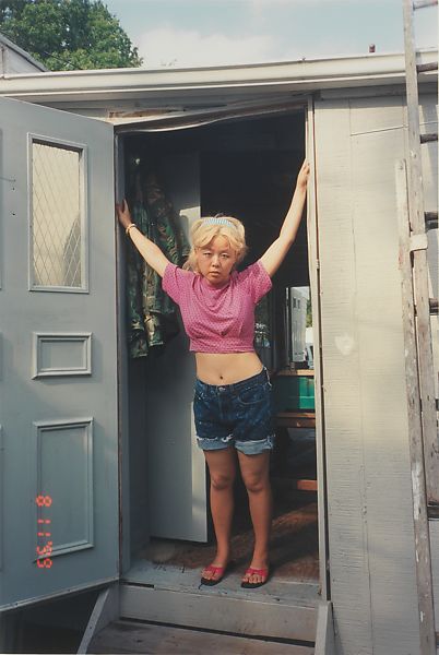
I used varying photographic styles including; candid, documentary and portrait. it was my intention to present these images together in a reportage style where they create an emotional response from the viewer. Following feedback from my tutor I edited the final set to bring more uniformity, electing to drop the images using text to convey a message in favour of more connotative imagery. The typological relationship between the final images was further strengthened by both the colour grading and the portrait orientation of all images in the set.

Post Processing

Because the images were captured in various cameras it was necessary to spend time equalising the tonal ranges and making them look more cohesive. My intent was to colour grade the images to have the look and feel of stills from the  dystopian movie “Contagion”. To achieve this look movie stills were downloaded from the internet and imported into Lightroom. Suitable examples served as reference images whilst developing to produce a similar feel. Camera Calibration, Curves and HSL adjustments were used to add a level of Teal and Orange, to crush the blacks and pull down the highlights to create a flatter image. Grain was added and the image softened to create the required look. 

Editing

Because of the lockdown it was difficult to capture as many images as I would have liked. I eventually had to accept that I would need to work with what I had. Lightroom’s star rating and filter options were used to trial a number of edits. Printed contact sheets were used to make a closer selection before moving to individual printed 6X4 images which were printed and  “lived with”  Following tutor feedback the original selection has been reworked and additional images added to the supplement the original set.

Influences

The emotion of a pandemic needed more than icon centric imagery to convey it, I have sought to convey through metaphor and connotation the fear and unease created by this unseen and potentially deadly assailant.  

Peter Mansell’s work “Paralysis (Mansell P. (2016) Peter Mansell Imagery (online), Weebly.com website, available from: https://paralysed.weebly.com/#, last accessed 09/04/2020. where both his imagery and relay text support far more meaningful connotations than a non-coded iconic reading of the subject matter.

Robert Frank’s “The Americans”  Frank’s mix of industrial and street views with candid images of its inhabitants demonstrates how it is possible to capture the essence of a location and a time. 

The use of colour grading in cinematography for emotional or psychological effect  influenced my approach to his assignment. The film Contagion describes, in far more dramatic terms, a global pandemic similar to that in which we currently find ourselves. The Colour grading in the film helps convey trauma, fear, despair amongst many other emotions on a subconscious level. I have sought to convey similar emotion to the viewer by colour grading my still images to replicate a “disaster movie” feel.

Images

Reflection

I found candid photography difficult and the results were poor. I felt far more comfortable stepping back and capturing people moving within a scene, similar to the approach used in exercise 1.3. I used a model for close up images which immediately made the capture process easier. 

Reflection in the images of shop windows created the problem. I tried different times of day and used a circular polarising filter but overall results were poor. 

The use of colour grading to shape an emotional response from the viewer worked. When comparing the original images straight out of camera  with the final selection the sense of unease if apparent, however individual viewers may  have different responses.

Reflecting upon tutor feedback I considered the use cases for symbolic and illustrative imagery and re-edited the image set to remove illustrative images. My intention in this assignment was to create an emotional response and their inclusion in the set confused the symbolism and interrupted the flow. The final selection is much stronger for this edit.

Contacts-1Contacts-2Contacts-3Additional Contacts-1Additional Contacts-2


Assignment 2: Tutor Feedback

Overall Comments

Creative realisation under Covid-19 pressure. Searching for subjects during lockdown.
Have to be commended for this and there are some creative/symbolic image and a start
of a ’typology’ of comparing portraits of people with masses as well as the empty
Landscape. The more illustrative images (signs in windows) are less successful as they
tell the viewer rather than show the effects of the phenomena. Some difficulties
accessing the original submission (on drop box – which I don’t use) much better to stick
with one system – notifications didn’t come for this submission for some reason so
apologise for late feedback. Do title the digital files with name (and student number if
possible) – good idea to tile the folder as practice for submitting to others outside OCA
education system – to avoid files getting lost.

To revise – think about approaching any phenomena such as Covid with a two pronged
strategy. Images of windows with ‘closed’ signs to explanations of Covid information are
absolutely valid for submission to a library (such as Alamy) for ‘illustration’ in a
newspaper etc. How to show the affect of pandemic (emotionally, economically, socially)
and approach subjects with the codes which contextualise this. Studying some of the
influential photographers who used reportage but with this more conceptual way of
working (Walker Evans, Berenice Abbot:) will help. For constancy, if reportage (people
caught unawares) isn’t your presence – set up portraits and work with the subject.

Feedback on assignment

Demonstration of technical and Visual Skills, Quality of Outcome, Demonstration
of Creativity
• Signs in windows are obvious and don’t fully contextualise the effects of the
lockdown. Having said that headless mannequin with text is on to something ( see
Atget in – Readings). Perhaps stand back your viewpoint in this. Cropping in close
tends to be a way of battering the viewer over the head with ‘look at this” rather than
allowing the symbolic to breath. After all we are talking about context as a
determinant of Maning here. One aspect of this is allowing the ‘internal context’ to
provide encourage – the social and environmental effects of lockdown and Covid-19
tension. We need to see what’s win the wider frame. For some images an extreme
close up can work in sequence (A2 – Pandemic-13-10.jpg ‘hope’) – experiment this on
the contact print so we can see at the time of taking you have provided the editor (in
this case you – but on assignment would be someone else who may prefer a wider
shot).
• There are the beginnings of a strategy to approach the representation of Covid
lockdown. A combination of typology portraits with the desolate images could work
well.
• Some (A2 – Pandemic-11-8.jpg) are less successful as they are grabbed images,
whilst useful for ‘news’ they aren’t as strong as if you continued in the same approach
as A2 – Pandemic-2-4.jpg. Consider rejecting on this difference between a ‘reportage’
/ Robert frank way of working and a more considered set up portrait in your blog.
Decide which way to construct the sequence (one is not better than the other).
• Selection of images. If queue from the back of shoppers doesn’t fully show the
emotional effects of Covid then take out. One or two images not included could have
worked better (A2 – Pandemic – 49) a more symbolic still life as well as – A2
Pandemic – 9 – the markers on the floor and the feet suggest this unease. If
approaching strangers to make pictures without permission is not your thing then
think of a different strategy – see Bruce Gilden v Laura Pannack (in – Readings.)
Coursework
Demonstration of technical and Visual Skills, Demonstration of Creativity
• Reface your finding from course work exercises and say how you used this in your
assignment.
• Outline in evaluation of your assignment is well expressed and engaging (this is one
of you strengths). Consider that the ‘reportage’ approach you decide on is useful but
your images are hinting at something more considered than that (the comparison of
portraits/still lives and landscapes). Say where you got this from – reface to exercises
so that research is integrated.
Research
Context, reflective thinking, critical thinking, analysis
• No problem with using a variety of methods / tools at this stage (Jim Goldberg a
useful photographer to consider here).

• ‘work with what I had’ is fine and understandable. A re-edit with some on the contract
print would be useful. Consider ‘research’ can be a combination of referencing key
texts on genres/approaches but also visual. The contact print could be annotated or
bullet point findings to show the viewer how you decided on what to include in the
sequence (and what to leave out). This could go through a few more iteration before
final sequencing for submission.
• Reference influences in your blog (Contagion etc).

Learning Log

Context, reflective thinking, critical thinking, analysis
• Your reflections on the blog are critical and appropriate.
• As you say images ‘not particularly subtle in their messaging’ so reflect on the
difference between symbolic and illustrative images in the blog.
• Perhaps, a small suggestion, but retreat from ‘in my opinion’ and adopt a third person
reflective research outline. In that way you can discuss ‘stereotypes’ (https://
holliwomble2.home.blog/2020/06/04/3-3-nigel-shafran-washing-up-2000/) but outline
how our ‘opinions’ are influenced from assumptions rather than evidence. It’s our job
as photospheres to find evidence but at the same time we can express ‘inner world’
of feelings according to the approach we make. Both are valid.
Suggested reading/viewing
Context
Reportage approach is working well for this but consider that you have the start of a two
pronged representation here. Best summarised by comparing a ‘typology’ set up portrait
(Laura Pannack) with a more ‘in your face’ approach (Bruce Gilden)
• Bruce Gilden, Interview with Bruno Bayley, Vice Magazine, Jul 16 2013:” https://

http://www.vice.com/en_uk/article/ppq78g/bruce-gilden-is-comfortable-taking-
photos-of-strangers

• Laura Pannack, The Walks, Full Bleed,17 Mar 2016: https://www.vice.com/en_uk/
article/ppq78g/bruce-gilden-is-comfortable-taking-photos-of-strangers
• What Bruce Gilden Learnt Photographing in Grocery Store Parking Lots During

COVID-19: https://www.magnumphotos.com/newsroom/what-bruce-gilden-
learnt-photographing-in-grocery-store-parking-lots-during-covid-19/

Pointers for the next assignment / assessment

• Send images and text via goole drive as you have done
• Practice summarising research findings in a concise form – even having a summary
at the top of each part.
Please inform me of how you would like your feedback for the next assignment:
written or video/audio.

Strengths Areas for development

Creative approach sampling a range of
approaches from reportage blurry images to
still lives and landscapes as well as a more
considered typology approach.

one or two images ‘illustrate’ with text. You
could combine the different genres or imply a
more consistent typology approach. The
sequence needs a re-edit and refinement –
perhaps including some images as discussed
that you have not chosen from the contact
print.

Contextualisation and working to find
meaning is evident drawn from your
research.

Avoid too much over-thinking as you gather
images. Let it emerge in the edit/re-edit. This
takes practice but it is well on its way. Continue
experimenting this as it is working.

Blog / Written work.

Step back from ‘in my opinion’ and ground it in
research findings. Discuss stereotypes and
how you might approach photography to
question these and show the ‘unseen’ above
pre-conceptions. What strategy you choose to
represent your subject is key and will come
from these readings which you clearly understand.

A2: Photographing the Unseen (Draft)

Overview

This assignment required a subject that might be considered “unphotographable” The first requirement of the process was to identify subjects that fit this remit. I identified the following:

  • Ageing
  • Belonging
  • Being myself
  • Anonymity
  • Worry / anxiety
  • Love
  • Loss / grief

Any of these ideas could have been used as the subject matter for such a photographic assignment. But right now, in the midst of a global pandemic, at a time when our government, scientists  and the country as a whole are struggling to find answers I find myself locked down at home.  My employment is suspended without end in sight but I am not alone. Across the country millions of people are in the same position, pub’s cafe’s restaurants and all but essential shops are closed, social distancing measures are enforced and our population’s movement is restricted. Considering the above, the answer to the question as to what subject matter fto use for this exercise is obvious, it has to be “Pandemic”.

Approach

I used the apple notes app on both my iPad and phone to keep notes of ideas.  I used mind maps to help me consolidate my thinking and transferred the outcome of the mind map into lists that I could then prioritise and work towards when planning my photography.

The lockdown meant that spending time outdoors was limited and that time had to be for essential shopping or exercise. We were permitted to take a camera with us when exercising but that didn’t extend to spending hours outside looking for a photographic opportunity. With travel by car restricted I had to plan how I could capture the images I wanted.

Over the course of several weeks I used a variety of cameras including my iphone to capture what I was looking for, the size of the device chosen to fit either a need for discretion, portability or image quality. I found that working to a plan where I knew when going out what it was that I was trying to capture really helped. The plan gave me time to consider the methods I could choose to capture the shot.

I used varying photographic styles including; candid, documentary and portrait, ultimately however it was my intention to present the images in a reportage style set where the images created an emotional response from the viewer. This process underlined how images can be created for one purpose and used for another as some of the images could be used as photojournalism or documentary purposes as well as my intended purpose.

Because of the lockdown I found it difficult to capture as many images as I would have liked. I eventually had to accept that I would need to work with what I had. I spent several days shuffling them about in lightroom, I even printed contact sheets and “lived with them” looking at them throughout the day. Once I had a shortlist I started the editing process.

Because the images were from various cameras I spent time equalising the tonal ranges and making them look more cohesive. My intent was to colour grade the images to have the look and feel of stills from the  dystopian movie “Contagion”. To achieve this look I downloaded some movie stills from the internet and imported them into Lightroom. I picked a suitable example and used it as a reference image whilst developing mine to have a similar feel. I used the calibration, curves and HSL tools to add a level of Teal and Orange, to crush the blacks and pull down the highlights to create a flatter image. I also added grain and softened the images to create the look that I wanted.

The final result is a sequence of images that are not particularly subtle in their messaging. I interspersed obvious visual messages taken from high street shop windows with dystopian street scenes and images of people wearing face masks. It was not my intention to add any form of text with the images, they needed to speak for themselves. They are intended to be viewed as a sequence as numbered as I believe this produces the strongest narrative.

4.2 Advert

Exercise

Rip out an advertising image from a newspaper supplement and circle and write on as many parts of the image as you can. Comment on what it is, what it says about the product and why you think it’s there. 

For this exercise I took an image from a free magazine available at Aldi Supermarket. The advert is for various products that are due to be available in their store from Thursday 18th June.

Use of colours

There is strong use of red and yellow in the advert. Red is one of the most visible colours of the spectrum to the human eye and it has been used in the advert to attract our attention both to the overall advert and, more importantly, to the most important messaging.(J.L. Morton. Graphics and Text) This includes the price of items where high contrast (white on red) has been used to make the prices and the statements such as “super weekly offer” stand out. Yellow is the most visible colour to the human eye and it has been used here alongside red to draw attention to the most important messaging. The fruit on the righthand side of the image consists of primarily yellow and red fruit which agin draw the eye.

Use of text and symbols

The advert uses multiple symbols to communicate meaning. These symbols are generally perceived in the UK as positive signage pertaining to food quality.

  • 100% British Beef (union jack symbol)
  • Assured Food Standards (red tractor symbol)
  • Minimum 12 Month Reared (gold cow symbol)
  • Specially Selected (black/gold square text box)
  • Team GB (Lions head and olympic rings symbol)

The use of colours which are suggestive of quality (suggesting British standards recognition) and which also connote national pride, are evident in these signs. specifically black and gold and red white and blue. The national pride connotations only apply to those in the UK who feel British. It is less likely to have a positive impact in, for example, Scotland. And it would not carry such recognition in other countries.

At the top left of the advert the word “like” has been emphasised. The word is in block capitals whilst the words around it are in lower case and the scale has been dramatically increased. Each letter has been spaced further apart than is usual and a multi-coloured shadow has been applied to make the letters stand out from the page. The effect on the viewer is almost an instruction “you will like these products!”

Other regularly used words on the page include:

  • Amazing
  • Super
  • Quality

These words are repeated throughout the advert and other words are kept to a minimum. The repetition of key words helps the advert to convey a defined message and adds to the overall significance to to the intended viewer.

Iconic Signs

On the lefthand side of the page there are five separate images of cooked meat products. The red on yellow labelling acts as an anchor to each image telling the viewer what they are looking at. In each case the meat product looks freshly cooked and  succulent there is a glossiness to the outside of the meat suggesting juices from cooking. Each of the meat products is shown with seasoning applied and an accompaniment of salad or vegetables to suggest that it is being served to the viewer. The use of a dark background and hints of a marble or slate platter and napkins suggest a restaurant setting. The lowermost image includes a fork in the image suggesting that the meat is about to be eaten. With the exception of the images of burgers (which you would expect to bite into) all of the other meat images show the meat partially sliced so that the inside of the product can be seen. The interior surfaces appear moist (glossy) and the red / pink colouration connotes a succulence and tenderness.

On the upper righthand side of the page there are images of eight people, they are young, healthy looking and dressed in matching sportswear which includes a union jack motif. The image strongly suggests that these individuals are part of the British Olympic team. The people are depicted in front of the lower half of a stylised Union Jack symbol with what appears to be exploding pieces of fruit. The Union Jack Connotes national pride and the “fruit explosion” connotes freshness. There is text acting as a relay to this part of the advert stating “it’s amazing what you can achieve when you have a team like this behind you”   Not being interested in sport I am led to wonder if these individuals are olympians or store workers or perhaps olympians who also work in Aldi. The detail in this part of the image is lost on me but the overall addition to the advert is a suggestion that the achievement of health and fitness at the highest level is associated to consuming the fresh fruit and vegetables depicted on the lower half of the page.

In the very small print at the bottom of the page there is a statement “Photography shows serving suggestions”

References

J.L. Morton (n.d.) Color Matters – The meaning of red [online] J.L. Morton.
Graphics and Text (website) Available from: https://www.colormatters.com/the-meanings-of-colors/red. Last Accessed 17/06/2020.


Semiotics Notes

Roland Bathes applied Semiotic theory to the study of images. Prior to this Semiotics were only considered for written communication. Actually Semiotics  apply to all forms of communication.

Definition: 

Sign = Signifier + Signified

Signifier:   includes the codes presented by the creator to show their intent. (the intent)

Signified: includes the interpretation of those codes by the recipient. (the perception)

Sign: is the outcome of both (the effect)

The Signifier may use denotation and connotation to describe it’s meaning. These elements of the communication process can be broken down into codes as follows

Symbolic Codes

Within imagery symbolic codes are very easy to read. An image of an apple symbolises an apple. Whatever symbol is presented our brain accepts it as the item intended. This is very useful as otherwise we would not be able to understand the moving images on our television. What we look at are millions of moving specs of light but what our brain recognises feels so realistic that the barrier between imagery and real life is broken down.

Symbolic Denotation = “This is an apple”

Symbolic connotation = “It is a juicy apple / tasty apple”


Semantic Codes

Semantic codes describe the generally accepted hidden meaning in the communication. For example a red traffic light is recognised to mean stop, smoke issuing from a building might indicate the it is on fire. These are learned meanings which we acquire throughout our lives. The most significant of these codes is how we learn to read the expressions on another human face. These codes are subtle and complex and take time to learn, hence children are poor at reading adult emotions. Individuals with Autistic brains may also be unable to read the semantic codes in faces or verbal communication amongst other forms of communication.

Proairetic (action codes)

These “action” codes describe the presumption of follow on actions to those displayed in the image. For example, an image of a bowler running on a cricket pitch with a ball in his hand or a man drawing a gun or person wildly off balance all imply a follow on action or conclusion to the action.

Hermeneutic Codes (or Enigma Codes)

This is nothing to do with WW2 decoding machines. These codes describe a sense of mystery in the communication.  An examples of Hermeneutic coding might include obscuring part of a image in dark shadow. i.e. a dubious looking man standing under the light of a street lamp so that only part of his body/face can be seen.

 Cultural or Referential Codes.

These codes refer to signs that require the recipient to have a particular point of reference such as age, gender, ethnicity, religion, being a member of a group or industry. These reference points mean that the recipient can/will perceive and interpret a sign that otherwise may be misread or not understood at all. Industry specific abbreviations and codes are an example where in a hospital a CAT scan has nothing to do with a small domesticated feline.

4.1 Elliot Erwitt’s Dog Image – Composition Notes

Exercise

Before you read any further, look carefully at Erwitt’s image and write some notes
about how the subject matter is placed within the frame. How has Erwitt structured
this image? What do you think the image is ‘saying’? How does the structure
contribute to this meaning?

Notes

download

  • The rule of thirds has been used which should direct the viewer to both of the dogs but the central positioning of the human makes her legs equally important.
  • The three subjects are equally spaced away from the sides of the frame and their feet lay along the the lower horizontal third line.
  • The eye is led from right to left rather than the usual left to right, perhaps this is because the perspective of the camera was aligned to the small dog’s eye line and the dog is looking into the camera (eye contact) and the dog’s positioning is the strongest in the frame (between the upper and lower third lines and sited on the left hand vertical)
  • The field of view is shallow meaning that the foreground and background are blurred whilst the main objects are sharply in focus making the subject matter very apparent.
  • There is part of the large dog’s hind leg showing in the upper left of the frame. This helps the viewer to realise that the rest of the dog continues outside of the frame but to me it appears undesirable as it distracts from the clean edges .

3.3 Childhood Memory

Exercise


Recreate a childhood memory in a photograph. Think carefully about the memory
you choose and how you’ll recreate it. You’re free to approach this task in any way
you wish.
• Does the memory involve you directly or is it something you witnessed?
• Will you include your adult self in the image (for example, to ‘stand in’ for your
childhood self) or will you ask a model to represent you? Or will you be absent
from the image altogether? (You’ll look at the work of some artists who have
chosen to depict some aspect of their life without including themselves in the
image in the next project.)
• Will you try and recreate the memory literally or will you represent it in a more
metaphorical way, as you did in Part Two?
• Will you accompany your image with some text?
• In your learning log, reflect on the final outcome. How does the photograph
resemble your memory? Is it different from what you expected? What does it
communicate to the viewer? How?
It might be interesting to show your photograph to friends or family members –
perhaps someone who was there at the time and someone who wasn’t – and see
what the image conveys to them.

Approach

As we live our lives we create memories, as we get older some of those memories do not appear to last as long as those we made in our younger years. I wanted to recreate a very strong memory from my childhood, the emotion I felt on the first day at school. This was a significant milestone in my life, one in which I had to move away from a place where I felt comfortable into an unknown and seemingly daunting environment. There have been many more such moments in my life but this one holds the strongest memory. 

I am absent from the image because my memory is one of a witnesses perspective. I decided upon a semi-literal representation for my image. I captured an image of a school campus viewed from the entrance but this was not my school. It is not possible for me to travel to my old school on the mainland so technically this is a metaphorical representation but equally it is  literally an image of a school. The camera was positioned at a low angle to simulate my perspective at the age of five. I think this choice of representation is the strongest mechanism with which to convey my message. The viewer will, I hope, recognise the same moment in their lives and reminisce about their first day at school, therefore the choice of school is no longer of significance. 

I titled the image in order to guide the viewer’s perception through “relay” but I chose not to add any further information. For the viewer to achieve reminiscence I felt that the image needed to be impersonal and flexible enough for them to relate to their own experiences. 

Final Image

_IMG0797

3.4 Nigel Shafran – Washing-up 2000.

Exercise

Shafran’s work is mainly derived from his personal life and includes information about his eating habits and his wife’s whereabouts. In the series Washing-up, through beautifully lit and composed images of sink areas after washing-up time, and accompanying text, Shafran gives us an intimate insight into his daily routines and family life. Objects and information, tastes and preferences shine through what on the surface appears to be banal and homogenous subject matter. The more you look at the images, the more distinctions you can make and the more insights you get. His use of everyday domestic environments gives the viewer a point of resonance and a sense of shared experience in the commonplace activity of ‘doing the washing up’

Go to the artist’s website and look at the other images in Shafran’s series. You may have noticed that Washing-up is the only piece of work in Part Three created by a man. It is also the only one with no human figures in it, although family members are referred to in the captions.

• Did it surprise you that this was taken by a man? Why?
• In your opinion does gender contribute to the creation of an image?
• What does this series achieve by not including people?
• Do you regard them as interesting ‘still life’ compositions?
Make some notes in your learning log.

010washing_up

Research and reflection

Until it was mentioned in the text of the exercise above I hadn’t noticed that washing-up was the only piece of work in part three created by a man. I can however see how the viewer of such an image may make such an assumption. Perhaps this would be the “unseen” element of any image, the capacity to promote an assumption in the viewer based upon visual clues and the viewer’s social context and life experience?

Surprise was not a word that I would associate with the recognition that images of washing-up had been taken by a man rather than a woman. Individuals of  either sex and any gender are unique in how they view and react with the world around them. It is equally possible for either a man or a woman to photograph domestic scenes. The images of washing-up included elements that were possibly, and I mean possibly in the mildest sense, indicative of male presence, notably the paintbrushes and lager cans on the draining board. It amused me as I later browsed Shafran’s other works to note that it was Shafran’s wife that was pictured wearing decorating overalls as its reminded me of the socially ingrained gender bias to which I had almost succumbed.

Book-order-029-700x467

The sex or gender of the photographer contributes to the way in which they create an image. The photographer’s eye is influenced by a multitude of things including ethnicity, age, sex, gender, upbringing, wealth, in fact all manner of lived experience.

Much has been written about the “male gaze” in describing the photographing of women. John Berger stated that ” Women are depicted in quite a different way from men – not because the feminine is different from the masculine – but because the ideal spectator is always assumed to be male.” Charlotte Jansen argues in her excellent article in BJP that as the number of female photographers, whether professional or as is most prevalent social media posters increase so the “female gaze” is bringing balance to what was once a patriarchal medium. She states “Do women photograph women differently to men? Certainly.  And female subjects interact differently with the camera when a woman is behind it” “Women see the world differently – in just as much colour and nuance. We are beginning to see that world, everywhere we look.”

The Washing-up series represents a modern take on still life imagery. By not including a person the viewer is not distracted from taking in all of the details from the image. If a person was to be included in the image the viewer’s gaze would be drawn initially to the figure and a narrative reasoned from visual clues offered by the figure with the remainder of the image only seen as background. Without a figure in the frame a narrative is created from the scene alone, the viewer noticing the smallest of clues as to what has gone before or may come after this moment.

002washing_up

Still life is not my favoured photographic genre, however after spending time browsing Shafran’s website I found myself enjoying some, but unfortunately not all, of his work. I found Washing-up a far more interesting visual read than I had expected and this is reflected in my approach to Assignment 3.

References

Bainbridge S. (ed.) (2017) The female gaze [online]. BJP website. Available from:  https://access.bjpsubs.com/female-gaze-issue-download/?submissionGuid=f8a8a8ed-ebd6-4822-9062-755c49489f1d. Last accessed 04/06/2020.

Berger J. (1972) Ways of Seeing . London. Penguin Books Ltd. p64.

Bibliography

Shafran N. (2000) Washing-up 2000 [online]. Nigel Shafran website. Available from: http://nigelshafran.com/category/washing-up-2000-2000/page/7/. Last accessed 04/06/2020.

Smyth D.(2018) Everyday beauty with Nigel Shafran [online]. BJP website. Available from: https://www.bjp-online.com/2018/05/shafraninterview/. Last accessed 04/06/2020.

Jobey L. (2008) Photographer Nigel Shafran: domestic harmony [online]. The Guardian website. Available from: https://www.theguardian.com/artanddesign/2008/oct/23/nigel-shafran. Last accessed 04/06/2020.

Bainbridge S. (ed.) (2017) The female gaze [online]. BJP website. Available from:  https://access.bjpsubs.com/female-gaze-issue-download/?submissionGuid=f8a8a8ed-ebd6-4822-9062-755c49489f1d. Last accessed 04/06/2020.

Jansen C. (2017) Girl on Girl. Hong Kong. Laurence King Publishing Ltd.

3.2 Masquerade (Nikki S. Lee and Trish Morrissey)

Nikki S Lee

In her various Projects, Nikki S. Lee (an American of Korean origin) finds subcultures,
transforms herself physically, and includes herself in the picture so that she blends in
with the group and becomes one of them, or infiltrates a particular subculture and
appears as though she is genuine. For example, she has ‘become’ a Chinese tourist, a
Puerto Rican woman, a hip hop fan, a runner, a bride… the list goes on.

  • Is there any sense in which Lee’s work could be considered voyeuristic or even
    exploitative? Is she commenting on her own identity, the group identity of the
    people she photographs, or both?

Nikki S Lee, born in Korea and later naturalised to the US wanted in her youth to be a film actress. She was dissuaded from this career path by her parents, but moved to a career in photography because they approved of it.

I think that it was Lee’s fascination with acting, with the inherent taking on and presenting of other personas that drives her exploration of how people present themselves in terms of culture, social norms or work in her Projects series (1997–2001)

The National Museum of Women in the Arts (NMWA) described Lee’s work on these projects as: “She practiced and performed the codes and visual signs of specific American sub-cultures, including yuppies, swing dancers, drag queens, hip hop fans, and senior citizens.  A point-and-shoot camera, wielded by a member of the selected group or a passerby, recorded her transformation and interactions. Lee believes that individual identity is fluid and that her Projects were extensions of herself.”

I don’t believe that the photographer’s intention was to exploit those that she chose to mimic in her images. Lee is commenting on her own identity by exploring how she is able to adjust how she looks, behaves, talks etc. (the codes and visual signs) to integrate with and pass as a member of another group or sub-culture. In this work she is becoming the actress that she wanted to be in her youth.

L2008.87 128

These images capture a moment in the lives of each group or sub-culture but they do not appear exploitative. As far as the question of voyeurism in concerned, I think that all visual media appeals to the our innate voyeuristic inquisitiveness and these images are no different.

Beyond her Projects series (1997–2001) Lee has continued to investigate the fluidity of human social presentation with her series “Parts” (2002). When describing this work in Susan Bright’s Art Photography Now Lee said ” You can see that it is one person [Lee] throughout and that her identity shifts and changes depending on whom she is with.”


Trish Morrissey

For the series Front, Trish Morrissey found groups of family and friends, strangers to her, on beachfronts in Britain and Melbourne, swapped clothing with one of the women
and adopted their position within the family unit or the group. When you look at each
image individually, the guise is faultless.

  • Would you agree to Morrissey’s request if you were enjoying a day on the beach
    with your family? If not, why not?
  • Morrissey uses self-portraiture in more of her work, namely Seven and The Failed
    Realist. Look at these projects online and make some notes in your learning log.

Trish Morrissey has published many projects experimenting with fluidity of personal presentation in photography. In her interview with Lens Culture (2016) Described her approach as “Weaving fact and fiction, I plunge into the heart of such issues as family experiences and national identities, feminine and masculine roles, and relationships between strangers.”

Hayley-Coles

I found a gentle her humour in her work which after reading her Lens Culture review I understand to be intentional. Unlike Gillian Wearing who goes to great lengths to achieve a near perfect deception Morrissey’s depictions are deliberately not perfect. It is quite possible when viewing her images to identify her place within the image.

Racheal-Hobson

Personally, Morrissey’s use of humour and the lack of intent to achieve a perfect deception makes her work far more appealing. Would I acquiesce to her request to swap places with a family member for a photograph? Yes, I think that I would providing I understood her intention at the time. I think that humour is an attractive argument, who wouldn’t want to be part of such fun?


References

Lens Culture. (2016) Trish Morrissey [online] Lensculture (website). Available from: https://www.lensculture.com/trish-morrissey. Last accessed 14/05/2020.

National Museum of Women in the Arts (n.d.). Nikki S. Lee Born 1970 [online]. NMWA.com (website). Available from: https://nmwa.org/explore/artist-profiles/nikki-s-lee. Last accessed 14/05/2020.

Bibliography

Trish Morrissey (n.d.) Trish Morrissey.com (website). Available from: http://www.trishmorrissey.com/index.html. Last accessed 14/05/2020.

Bright R. (2005). Art photography now. London. Thames and Hudson.

Cotton C. (2014). The photograph as contemporary art. Third Edition. London. Thames and Hudson.

3.1 Self Portraiture (Woodman, Brotherus, Wearing.)

Exercise:

Reflect on the pieces of work discussed in this project in your learning log and do
some further research of your own.
Here are a few questions you might ask yourself:
• How do these images make you feel?
• Do you think there’s an element of narcissism or self-indulgence in focusing on
your own identity in this way?
• What’s the significance of Brotherus’s nakedness?
• Can such images ‘work’ for an outsider without accompanying text?
• Do you think any of these artists are also addressing wider issues beyond the
purely personal?
Make some notes in your learning log.

Reflection:

I have really enjoyed the opportunity to “live with” and to reflect upon some of the published self portraiture portfolios of Francesca Woodman, Elina Brotherus and Gillian Wearing. It took me some time to move beyond my initial discomfort at gazing upon and reading images of individuals who are naked. I put this down to a very conservative upbringing and a level of social conditioning that tells us that naked is bad and to gaze upon such nakedness can only be voyeuristic. I discovered that the longer I spent with these images the easier I found it to understand the reasoning behind the images and to appreciate the messaging within the images.

When I consider the semiotics of Woodman’s and Brotherus’ work I feel both artists have confronted the traditional, male-centric objectification of the female form. John Berger states that “Women are depicted quite differently to men”….. “the ‘ideal’ spectator is always assumed to be male and the image is designed to flatter him” Both Brotherus’ and Woodman’s images do not, in my opinion, flatter the male viewer. There is no “calculated charm” expressed towards the viewer. There is purely self, naked rather than nude. Berger described this difference as “To be naked is to be oneself. To be nude is to be seen naked by others and yet not recognised for oneself”.

Model-Study-4


I found both Woodman’s and Brotherus’ images moving. Woodman’s work felt dark, moody and at times confrontational. Brotherus’ work, which is extensive, ranged from quirky and amusing to tender and very personal. Her project Annunciation when viewed chronologically needed no explanation. Her pain throughout was palpable and despite the intensely personal nature of the subject matter I didn’t feel as though I was intruding. The conscious viewer/viewed relationship disappeared leaving me with overwhelming sensations of sympathy and empathy.


Wearing’s work baffled me. I had to admire the considerable effort and the craftsmanship that went into the production of such lifelike and accurate silicon masks. The difficulties that Wearing encountered in lighting the portrait due to the different light reflecting properties of the silicon were fascinating. I appreciated the dedication needed to create these images including ensuring the detail of the backgrounds are true to the original snapshot image,  but I didn’t really feel the intended meaning of the artist just through viewing the images.

Wearings images presented self portraiture in entirely the opposite way to Woodman and Brotherus. Rather than the openness and brutal honesty of the nude or naked image Wearing presented a mask or a barrier to understanding the person beneath. Wearing described her intentions in Susan Bright’s book Art photography Now, when discussing the portrait of her mother, as: (when wearing the mask) “[I could] with my eyes and posture convince the viewer I was her” With this work Wearing appears to have inverted the entire notion of self-portraiture as that of an image of oneself. It is an exercise in artistic, sympathetic deception. For me it held less appeal than the work of Brotherus or Woodman.

Is there an element of narcissism or self-indulgence in focusing on your own identity in this way?

Narcissism can be defined as an “inordinate fascination with oneself; excessive self-love, vanity.” (dictionary.com) Self-indulgence can be defined as “indulging one’s own desires, passions, whims, etc., especially without restraint.” (dictionary.com)

I do not recognise any of the negative connotations of  narcissism in these works. In comparison to self portraiture on social media where people only present the best of themselves Woodman and Brotherus are brutal in their honesty. I find no sign of vanity or self love in their images. Both artists definitely demonstrate a fascination with  self. This kind of fascination is an entirely natural process that we all go through at some time in our lives and it is necessary for us to develop a sense of self. The differentiation here is that Woodman and Brotherus are prepared to share their intimate fascination with the viewer.

All three artists display self-indulgent traits within their work, but isn’t that one of the requirements of artistic output? I think that artistic endeavours necessitate a level of self indulgence in order to produce the best work possible.

What’s the significance of Brotherus’s nakedness?

There may be many motivations for Brotherus choosing to be naked in her images. I have already mentioned the apparent fascination with self that appears throughout her portfolio. In addition to this within her project “Annunciation” her nakedness, the absence of barriers, positively impacts the narrative. By showing herself to be naked in what appear to be intimate and distressing situations Brotherus conveys a sense of honesty, vulnerability. She exposes her pain and distress without any form of barrier.

In Brotherus’ later work she continues to photograph herself naked however she differentiates between her earlier autobiographical work and her more recent projects, stating on her website “Personally, I see a clear difference between my autobiographical photographs, for which I know the emotion in question, and the other ones where I appear as a model. In the latter, there is not necessarily any emotion that I could identify. It’s about composing a picture with a human figure in a space, and it can represent anything you want.”

38_Nu-bruxellois

Can such images ‘work’ for an outsider without accompanying text?

I needed explanatory text in order to make sense of Wearing’s imagery when first viewed. In this case the text explained the process the artist underwent to produce the images and this enhanced the viewing experience.

I didn’t find the need to textual explanation for Woodman’s or Brotherus’ work although I found that I needed to spend time with the images in order to more fully understand the narrative or meaning. In fact the more time I have spent considering the work the more I have gained from it.

Researching these works I found many texts and critiques that explain either the experiences of the artist at the time of the works or the motivation or original meaning of the work. These texts served in the main to enhance the viewing experience but were not a necessity.

Do you think any of these artists are also addressing wider issues beyond the
purely personal?

The work that I felt most addressed wider issues than just personal exploration was Brotherus’ project “Annunciation” which deals with the issue of infertility.  Other work by all three artists deal with issues that whilst being personal to the artists are also equally personal to some viewers.  Messages contained within such imagery will be recognised by many and their personal emotions projected onto the viewed work. As such these works will all deal, perhaps to a less degree to works such as “Annunciation”, with wider issues.

09_Annonciation+4,+Bruxelles+23.10.2010

References

Heikka E. Rastenberger A-K. (2016). The rules of the game [Online]. Elina Brotherus (website). Available from: http://www.elinabrotherus.com/texts. Last accessed 14/05/2020.

Berger J. (1972). Ways of seeing. London. BBC and Penguin Books. P45-64.

Bibliography

Cooke R. (2014). Searching for the real Francesca Woodman [online]. The Guardian (website). Available from:

https://www.theguardian.com/artanddesign/2014/aug/31/searching-for-the-real-francesca-woodman. Last Accessed 14/05/2020.

Bright R. (2005). Art photography now. London. Thames and Hudson. P51, 42-43.

Cotton C. (2014). The photograph as contemporary art. Third Edition. London. Thames and Hudson.

Bate D. (2009). Photography the key concepts. Oxford. Berg. P82-83.

Brotherus E. (n.d.) Elina Brotherus.com [website]. Available from: http://www.elinabrotherus.com/. Last accessed 14/05/2020.

Tate. (n.d.) Gillian Wearing CBE born 1963 [online]. Tate.com (website) Available from: https://www.tate.org.uk/art/artists/gillian-wearing-cbe-2648. Last accessed 14/05/2020.